For the past two weeks as I've waxed dithyrambic about the golden Honey Locust, I neglected one reason those leaves stand out so brightly. We have been enjoying the most beautiful weather, with bright blue skies. The contrast against the blue really makes the gold pop.

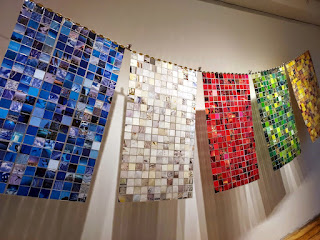
I've written about Green, Brown and Yellow, or Ochre; now I'll turn to turn to Blue.
I wore Blue to vote this week--I like to think it brought good luck.

I've looked back at what I've done with blue over the years, cutting and tearing up magazines, just playing with color, texture and sometimes images.

Edward Hopper's Ground Swell, "at once pacific and sublime, and seems paused on the precipice of action or danger. Painted in 1939 as the world teetered on the edge of war, it is a crisp but uneasy scene of sun-rays, sea-spray and the surging promise of youth." I used to tell my second graders when looking at a painting to imagine how they would feel to be inside that scene. I would love to be inside this painting. I haven't been to see the Hopper exhibit at the Whitney yet, even thought it's only three blocks from our house. Shame on me. I really hope to see Ground Swell there.
Working with torn paper I could be abstract in a way I never felt free to be in my drawings. I love the way the blue and the orange play against each other here.

And look at the way the skin of the orange makes the blue china pop.

Stripes and checks aren't supposed to go together but I like them just fine here.

Here's a shade of blue that tells of wonderful things to come.

I've always said my favorite color is red. According to color psychology, because blue is the favorite of so many and the color most preferred by men, it is viewed as non-threatening and conservative, calling to mind calmness and serenity. Sounds kind of dull, but look what a good time I've had with blue. maybe I should apologize. Or at least give it another chance.

Comments
Post a Comment